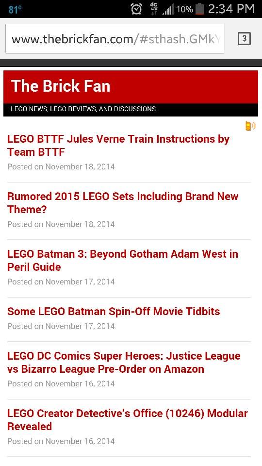
If you’ve been visiting the site on a mobile device the past day or so, you may have noticed some changes. With Google announcing that mobile-friendly sites could potentially give a search ranking boost, the SEO inside me decided to make some changes to appease the Google overlords and hopefully get the site exposed a little more to the masses.
The first thing you’ll see is less images, mainly the usual banner and the background. Instead I’ve opted to use more text and give it a cleaner look. I still have to configure the colors of the header but right now, I’ll leave it as it. At the bottom of the posts are the same ads you see on the desktop version of the site as well as all the categories. Commenting is also available using Disqus so nothing has changed there.
As a result of these changes, I feel that visitors can easily read the text without having to zoom in to the page to read it like before. Check out the site on your mobile device if you haven’t yet and let me know if there are any bugs or errors. I’m still going to be tweaking around with it to try and make it the best experience possible but so far it looks stable.
Update: A request I’ve gotten is a desktop option. That is one of the things I’m currently working on.
Update 2: I’m going to suspend this project until I figure out some things out for the long-term. Sorry for the inconvenience.

When you make a purchase or, sometimes, carry out some other action as direct result of clicking on a link at The Brick Fan, we will receive a small commission.
The Brick Fan is a participant in the Amazon Services LLC Associates Program, an affiliate advertising program designed to provide a means for sites to earn advertising fees by advertising and linking to Amazon.com. As an Amazon Associate I earn from qualifying purchases.
We partner with Rakuten Advertising, who may collect personal information when you interact with our site. The collection and use of this information is subject to the privacy policy located here: https://rakutenadvertising.com/legal-notices/services-privacy-policy/


Sorry guys but I really dislike the change to mobile. Please provide an option to have the standard full site, which for me is easier to navigate and is more appealing visually. Thanks for your hard work.
Thanks for your input Adam. That is one of the settings that I am working on.
Thanks Allan. I look forward to the minor tweaks and evolutions you guys take. Cheers.
I +1’d your comment, but I have to agree fully with everything you said. A lot of sites gain functionality when ported to a mobile version, but I felt like the mobile version of this site was a little clunky and unnavigable. I like having a preview of the article from the front page, if not the article in its entirety. Thanks Allen for keeping this site running!
The layout is great but I noticed some really inappropriate clickbait ads coming up. Might want to look into your ad provider.
Thanks. I’ve made changes to the ads.
Lol I was freaking out about it because it happened on my computer for some reason, and this wasn’t posted yet.
So thats why when i logged on to my laptop and went to your site it came up as a small mobile page instead of the regular brick fan page i was used to. Everytime i checked back it would switch from regular format to the mobile format.